99 cent plus asked Good Work Gallery to contribute the work of 11 artists and we delivered. In sticker form!
Featuring sticker designs by:
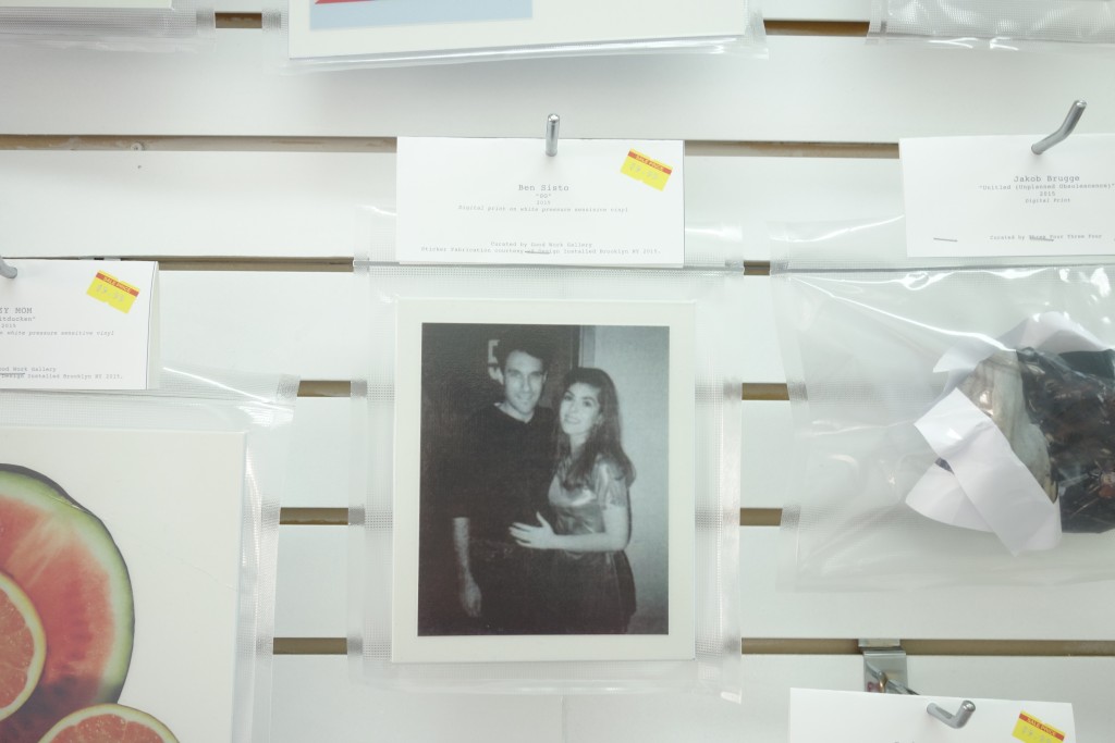
Ben Sisto
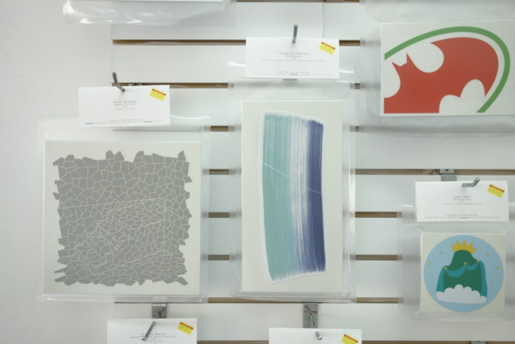
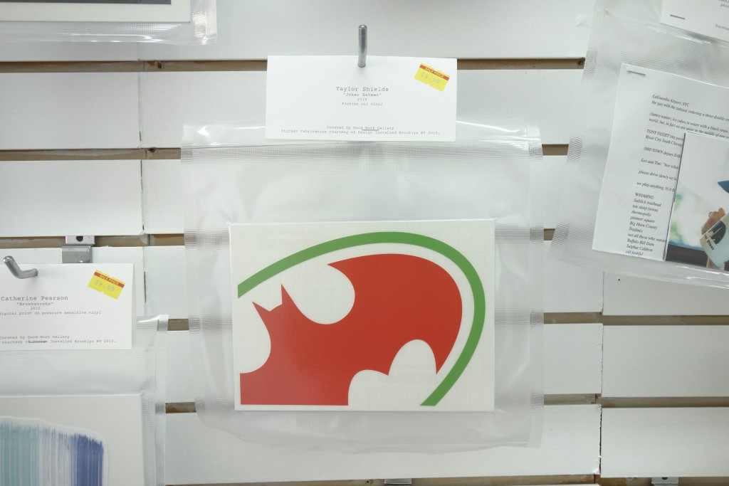
Catherine Pearson
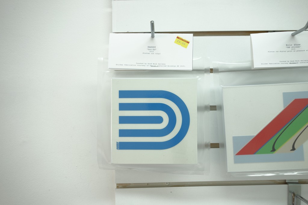
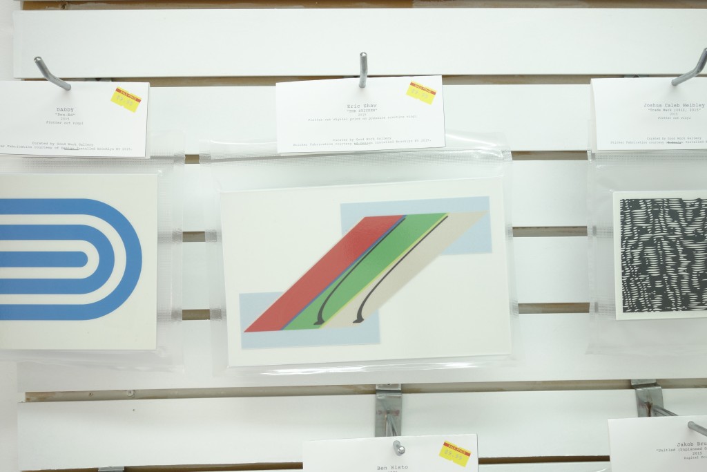
DADDY
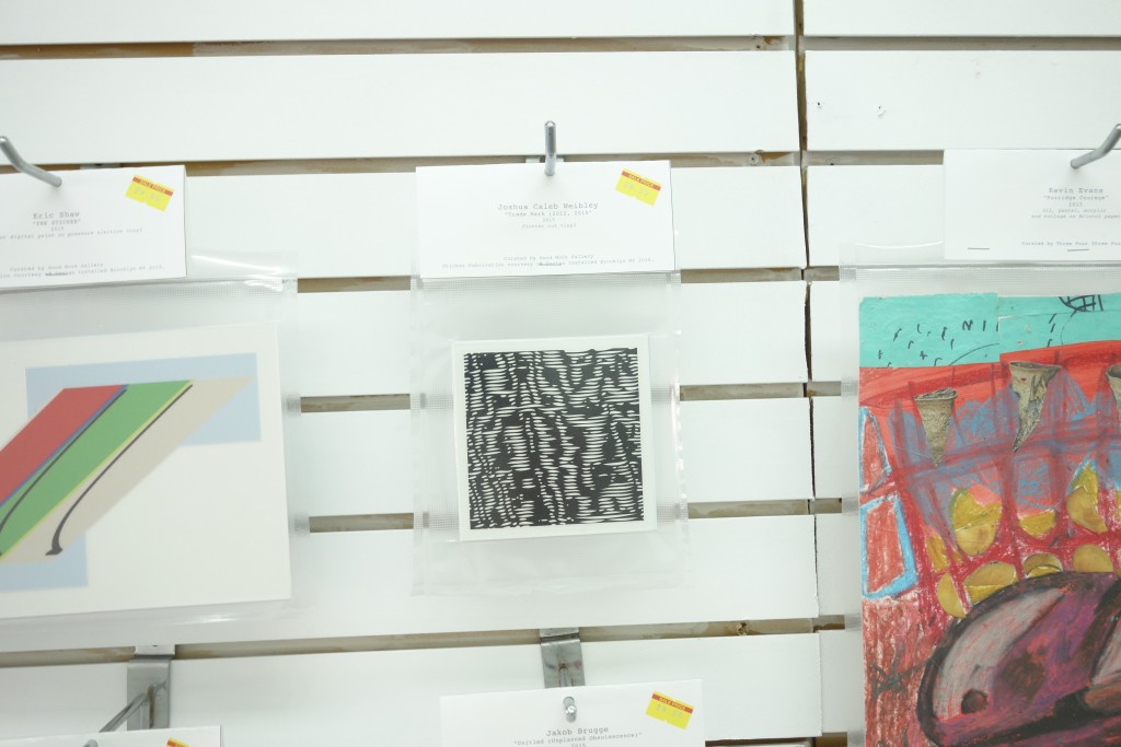
Eric Shaw
Joshua Caleb Weibley
LAZY MOM
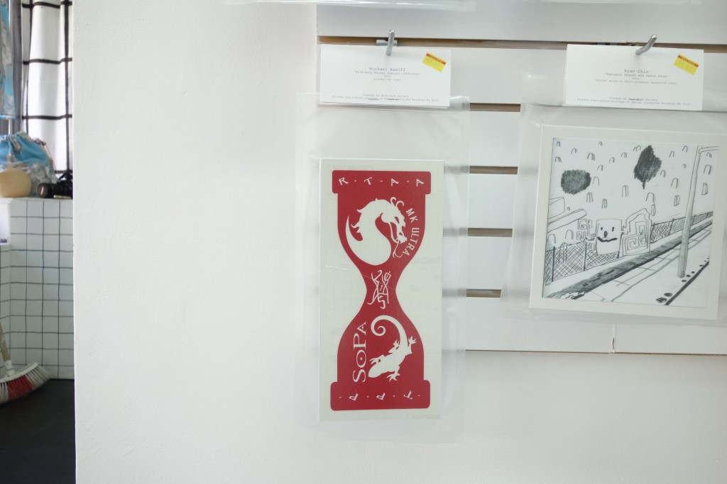
Michael Assiff
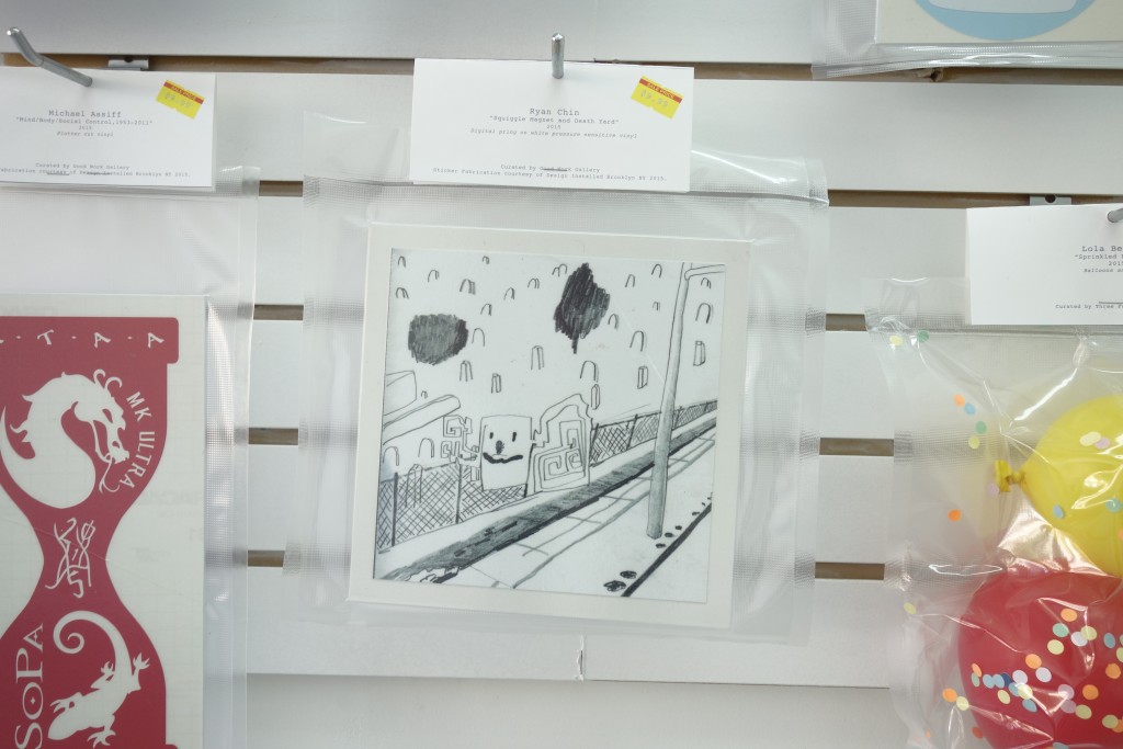
Ryan Chin
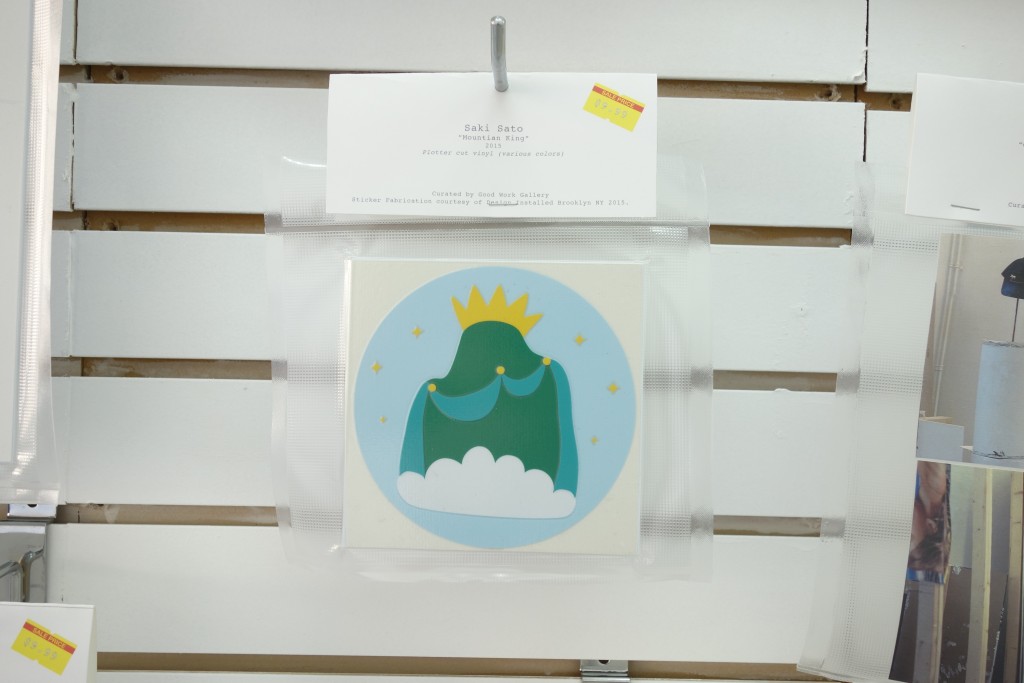
Saki Sato
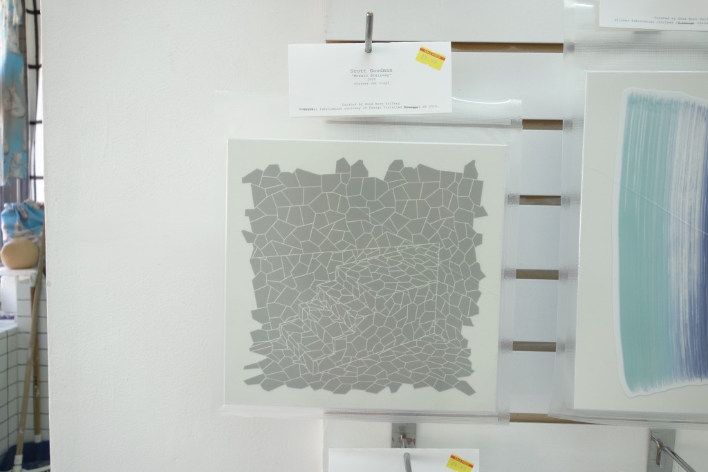
Scott Goodman
Taylor Shields
DSC00904
DSC00904
DSC00902
DSC00902
DSC00901
DSC00901
DSC00900
DSC00900
DSC00898
DSC00898
DSC00897
DSC00897
DSC00896
DSC00896
DSC00895
DSC00895
DSC00894
DSC00894
DSC00893
DSC00893
DSC00892
DSC00892
DSC00891
DSC00891
DSC00888
DSC00888
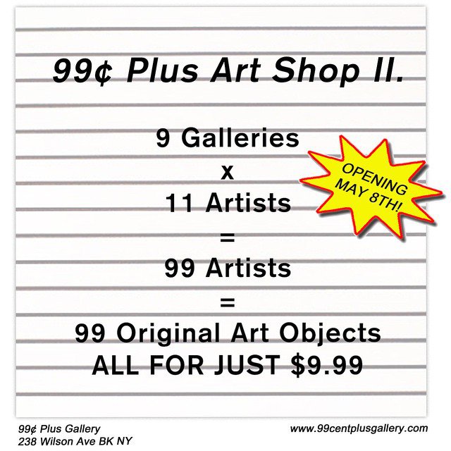
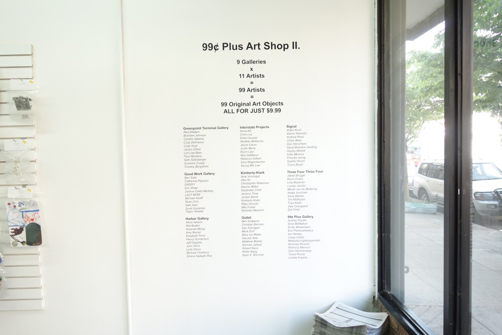
99¢ Plus Gallery is pleased to announce our 2nd Annual Exhibition and Fundraiser, 99¢ Plus Art Shop II. Almost exactly one year ago 99¢ Plus Gallery opened its doors for the first time with the Inaugural 99¢ Plus Art Shop. In celebration of an incredible first year and our immediate community of incredible galleries, curators, and artists, we have decided to continue the tradition. We have invited 9 local galleries to choose 11 artists each to donate one original artwork to 99¢ Plus. The work of all 99 artists, from emerging to established, is sold for a mere $9.99 in an effort to not only raise money for the gallery, but also to create an alternative art buying experience as accessible and inclusive as a 99¢ store.
Why:
All proceeds from the 99¢ Plus Art Shop go towards supporting an all-inclusive space in which the production, exhibition, and consumption of art and objects can exist under one roof. At 99¢ Plus Gallery we encourage alternative curatorial models, immersive installations, performance, and innovative approaches to art commerce. By involving 11 curators of what we believe to be some of the most interesting galleries in Brooklyn and 99 artists we expand our community and support artists from many different kinds of practices, experiences, and mediums. By pricing each work at just $9.99 we hope to make art accessible and create an inclusive buying experience.
May 8–10, 2015
Opening reception May 8, 6–10pm
Participating Galleries and Artists:
Greenpoint Terminal Gallery
Alex Ebstein
Brandon Johnson
Cecelia Salama
Cody DeFranco
Cody Hoyt
James Ulmer
Leif Low-Beer
Paul Wackers
Seth Adelsberger
Suzanne Coady
Timothy Bergstrom
Good Work Gallery
Ben Sisto
Catherine Pearson
DADDY
Eric Shaw
Joshua Caleb Weibley
LAZY MOM
Michael Assiff
Ryan Chin
Saki Sato
Scott Goodman
Taylor Shields
Harbor Gallery
Alicia Gibson
Alta Buden
Amanda Wong
Amy Brener
Elizabeth Ferry
Henry Gunderson
Jeff Degolier
John Silvis
Leah Dixon
Michael Childress
Shana Sadeghi-Ray
Interstate Projects
Anna KE
Chris Lux
Erika Ceruzzi
Heather McKenna
Jacob Ciocci
Justin Berry
Kevin Lips
Nick DeMarco
Rebecca Gilbert
Sara Magenheimer
Seung Min Lee
Kimberly-Klark
Aine Vonnegut
Alex Ito
Christopher Roberson
Dennis Witkin
Destinee’s Child
Jessica Tang
Jordan Barse
Kimberly Klark
Riley Duncan
Miki Foster
Nicholas Moenich
Outlet
Ben Godward
Christian Berman
Dan Flanagan
Haruka Aoki
Mark Dorf
Mary Ivy Martin
Matthew Mahler
Norman Jabaut
Robert Nava
Robin Kang
Ryan V. Brennan
Signal
Aidan Koch
Alaina Stamatis
Andrew Ross
Chloe Wise
Dan Herschlein
David Brandon Geeting
Hayley Martell
India Muenez
Priscilla Jeong
Sophie Hirsch
Travis Boyer
Three Four Three Four
Jakob Brugge
Kevin Evans
Lola Bezemer
Louise Jacobs
Marek van de Watering
Nadja Voorham
Silvia Martes
Tim Mathijsen
Tirza Kater
Vibe Overgaard
Zoë Field
99¢ Plus Gallery
Audrey Snyder
Elise McMahon
Emily Wissemann
Eric Pitradzkiewicz
Ian Harkey
Lacey Carter
Melkorka Ingibjargardottir
Nicholas Ricardo
Rebecca Manson
Sam Hemmenway
Tessa Perutz
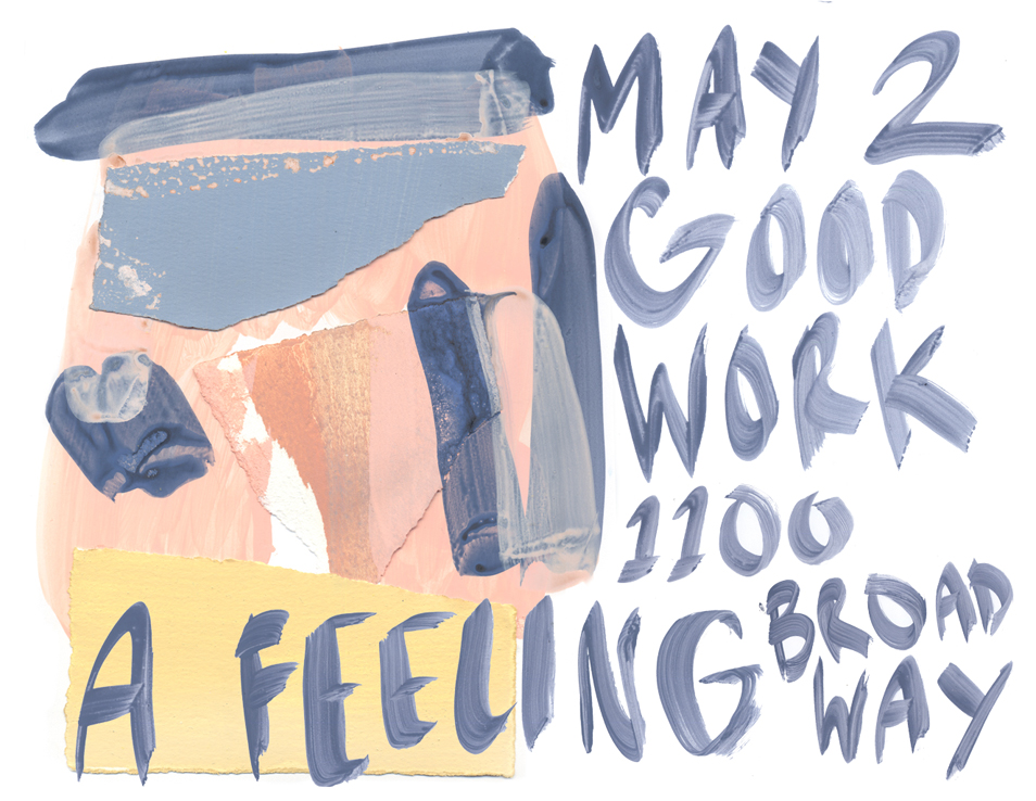
May 2 – May 22, 2015
Opening reception Saturday, May 2nd, 6-9pm.
Good Work Gallery is pleased to present the book launch of A Feeling by Catherine Pearson and an exhibition of her most recent paintings. A Feeling uses collage, photography, and watercolor with an immediacy and intimacy which contrasts and complements her more labor-intensive large scale work. The book provides both a context and a key to her approach to abstraction: content as a glimpse, as a feeling grasped. Pearson graduated from Cooper Union in 2010.
We interviewed each other about the work in our show Master & Lingo at Good Work Gallery. Here are our thoughts on art and various other subjects.
Design vs. Image / Pattern vs. Image / Decoration vs. Image
MM:Want look at some of these questions I e-mailed you?“When you’re drawing, do you make a distinction between designs and images?”
SS: Oh yeah, I wasn’t totally sure what you meant with that one. Instead of “design” vs “image”, I sort of thought about patterns instead. I was ordering samples to make wallpaper. And it was cool to think about making wallpaper because I was thinking: “Oh! I’d like to incorporate my objects [from the show]… but I have to put them in a repeatable pattern.” And that was kind of weird, because it made me wonder about what is “pattern” vs. “image”. That’s how I took your question.
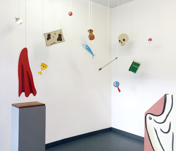
Fig. 1: “Items” by Saki Sato in Master & Lingo
[A Pattern] doesn’t usually have a message. It’ll be a collection of objects but it won’t really make you question each object in the pattern. “Oh, cute, it’s there,” you might think. You don’t really ask: “What is this corvette doing next to this motorcycle on these pajamas?” It’s not confusing, you just take it at face value.
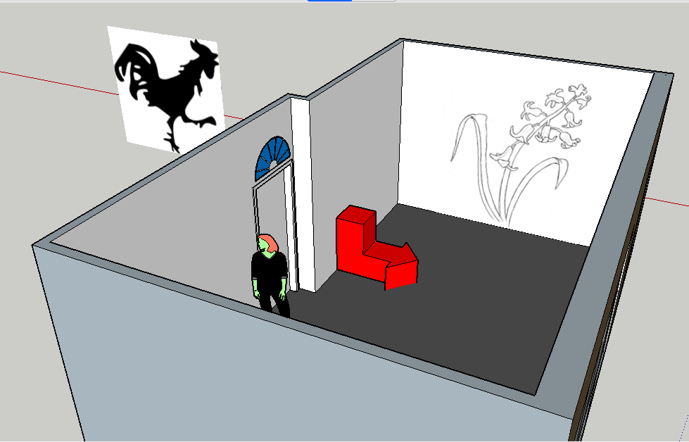
MM: I think I asked that question because when we were planning the show we talked about putting an image on the far wall by the door. We talked about using a flower or a rooster…and you didn’t really care what the image was.
SS: [Laughing] I know you were like, “Saki… What? Why?” And I kept saying, “No, stay with me, I just have a good feeling about the flower, Maren.”
MM: It was cool! I’m interested in this decorative image [you wanted to put on the wall] that was important to the show but not necessarily a piece…
Fig. 2: Preliminary model of Master and Lingo installation.
SS: Yeah, the weird thing about that one… I guess it was like— you’re right— maybe purely decorative. I wasn’t interested in what it meant. I wanted it to be a statement that would create an air of… 1) “Larger than life,” and 2) “In your face,” so you’d enter the show and be like, “Whoa. What is this? Big flower.”
But we didn’t do that! it would’ve been kinda weird and funny.
SS: Also, I was thinking about my objects, and how I like to try and make them the least specific I can. I mean, they are really specific but then I round the corners and solid out the colors— try to make them the most general I can. But they’re not generic, they still have character…
MM: They’re friendly.
SS: Yeah! And “friendly” glosses over a lot of things. Like a pattern. I guess i’m kinda thinking of the tension between “pattern,” which I see as a pleasing image, and “image,” which is like… presenting a meaning or asking questions about the significance of some juxtaposition. To me, pattern is just aesthetic juxtaposition.
MM: It seems like you’re interested in that moment of pushing the viewer to ask a question— Ok, so, you wouldn’t question the pajamas but…
[in unison]: Why not?
SS: Yeah, right? Maybe it’s the repetition… maybe it loses its meaning. And I was thinking, “If I do that with my things, what would they turn into?” Because so far nothing repeats. Each object is unique, and one is next to the other for a specific reason. Even though the reason is sometimes purely aesthetic.
MM: If you step back even further from the specificity of pattern, there’s the question of where to draw the line between an “aesthetic” decision and a “meaning” decision.
SS: On the one hand, there’s the scene that an image presents us. And you’re thinking: “Yeah…why IS that puppy looking away from us? Is he sad? Is he being abused? Is he happy to be looking out the window?” But like if you saw a pattern of puppies…I dunno. You might not think twice about what the puppies are thinking.
MM: It’s funny that you are talking about it only in terms of pattern. Could you also just use the word “decorative” ?
SS: That’s true. I guess I was thinking in terms of pattern because I wanted to make that wallpaper. But in terms of wanting to put that flower on the wall and it meaning basically nothing… that would be decorative.
I guess it’s more like emotional meaning. It’s more raw. It feels good. It’s like, aesthetically: “Yes.”
[MM laughs]
SS: It all comes back to that flower! [Laughing] I guess that’s the feeling I was having. And I couldn’t explain it to you at the time. All I could say was, “Flower, Maren. Flower!”
Maren Talks About Painting / Plato’s Theory of Forms
SS: What do you feel about “aesthetic” objects, like, curtains and rugs? People surround themselves with those objects because they feel nice. Or they’re useful. We need them, too.
MM: I think it’s a combination of things. First of all, I got really interested in objects that are almost two-dimensional. How a rug is…
SS: Literally flat.
MM: You can think of it as a pattern that goes directly into your house. Decoration. Or you can think of it as something physical, that you can stand on, that has a relationship to your body.
Same goes with the curtain. Though I think the curtain is a little bit more loaded [with meaning] for me just because it’s also fabric— like a painting is fabric— and you hang it on the wall or in front of something.
SS: I’m feeling you. They lend themselves to flat images well. They’re already pretty flat objects.
MM: It’s also partly because I was trying to make paintings for a long time and I was never able to do it on stretched canvas. All the paintings I’d make would be on panels. They felt to me like little tiles, or a physical panel. And then I also got interested in going the other direction too: painting directly on the canvas. Cutting it out and treating it like a piece of fabric when I put it on the wall. In the same way as I was considering the sides of the panels and how they were painted and how thick it was.
Fig. 3: “Plinth” by Maren Miller in Master & Lingo
SS: You’re turning a painting into an object. And then I’m trying to take an object and turn it into an image. You’re trying to make the 2D painting into a 3D object and I’m making the 3D object into a 2D image. We’re going back and forth in this world.
MM: But really, I think that neither of us are particularly attached to the final product of our sculptures. If something happened to my plinth I would just make another one. It wouldn’t be a big deal.
It seems like the same thing for your work. I think that has to do with being really interested in trying to translate what it means to be thinking or describing the experience of an image, rather than actually creating it.
SS: This makes me think of… I mean, I never looked into it that much and I don’t plan to because I like thinking about it how I want to think about it… but, Plato’s Theory of Forms.
MM: Yeah! I always think about that when I look at your work.
SS: I don’t know what he says in depth. But the gist of it, well… he applied it to geometry. Geometric shapes are perfect and they live in an ideal world and any material representation of them is just a copy. So we always know: “Ok we have this thing in reality but it actually lives in our minds.”
MM: And I feel like that’s really dependent on language and how we’ve been taught to talk about the world. That’s another reason that I like incorporating directional representations into my work. Cuz that feeling points to language in an interesting way, and how we understand space without a specific text.
SS: You’re taking an arrow, which is an image, but has language embedded in it. An image language, a universal language: it tells you where to go… You don’t need to know the word for what it’s trying to tell you. But its the language of directing you to things or conveying meaning at a very basic level.
Language of Symbols
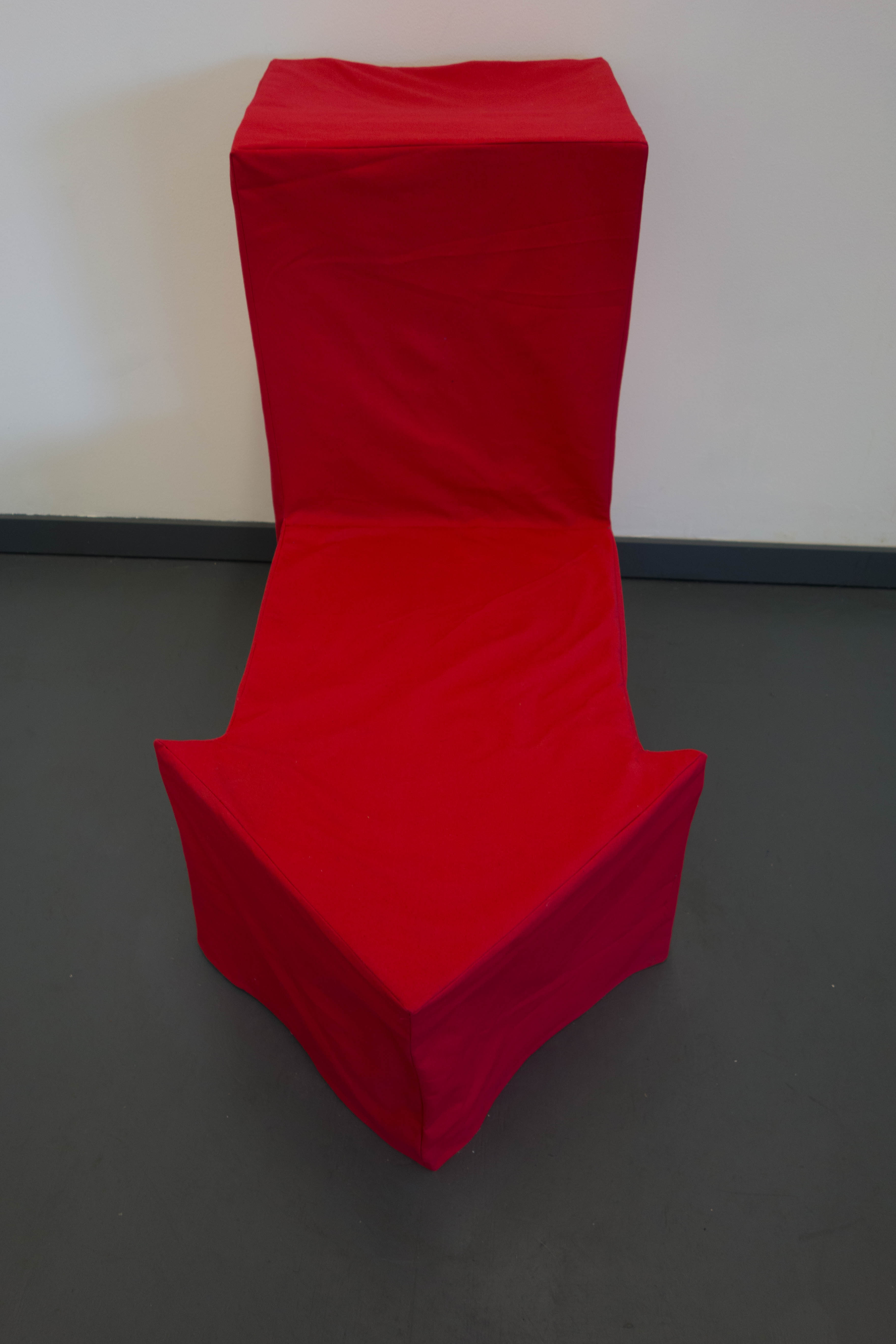
MM: The arrow chair wasn’t totally successful because I didn’t want to have to ask people to sit in it. But I wanted them to know it was a chair. Reminding you that it’s an object in a space. It relates to your body but doesn’t necessarily have to be about you directly experiencing it.
Fig 4: The arrow chair.
SS: It’s like you’re making use of the object. Normally it’s a symbol that you follow.
You have an object that exists in this world of symbols…the arrow meaning: “Go here.” You can never make it real… when you make a real arrow it’s always still a picture, it’s always an image. It’s never really an object, but in this case you’re making it an object you can use.
MM: But I also really like that moment of the actual object being really dumb. I wanted to conjure this image of sitting on it and then there being a big arrow between your legs.
SS: It’s like you’re degrading the arrow because it’s this universal symbol that you’re sitting on… but it’s also degrading you. By making fun of you.
Fig. 5: Our friend and gallerist, Scott Goodman.
MM: [Laughing] When I sent a picture of the sculpture to [our friend] Katya she kept texting me these phrases like: “The answer was sitting right in front of me!” I really liked that.
SS: Oh shit the neighbor’s cat! Chip come here I wanna show you to Maren!
MM: Awwwwwww
SS: His name is Chips. He doesn’t like being held. His name is the plural of Chip. Chips.
MM: Cool! Multiple Chips!
SS: So cute.
MM: So cute.
SS: So. We’re talking about the answer. That answer underneath you.
MM: The answer sitting right in front of you.
SS: We need to caption your sculpture with that some day.
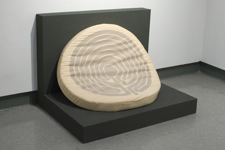
MM: I like that… actualizing language into a sort of dumb object. That’s definitely something I was thinking about when I made that labyrinth pillow a while ago.
Fig. 6: Labyrinth pillow by Maren Miller, 2010.
MM: The labyrinth has a really specific relationship to your body. Because you’re supposed to…
SS: To walk it.
MM: Yes. Historically, it’s this thing that you walk, this meditative moment. But zoomed out it’s no longer something your body can directly relate to. Then I put it on the pillow. And pillow is something that your body really has one really specific relationship to.
SS: Point of contact.
MM: Yeah. And it’s pointing to a different use of space. I was thinking about that with the arrow chair.
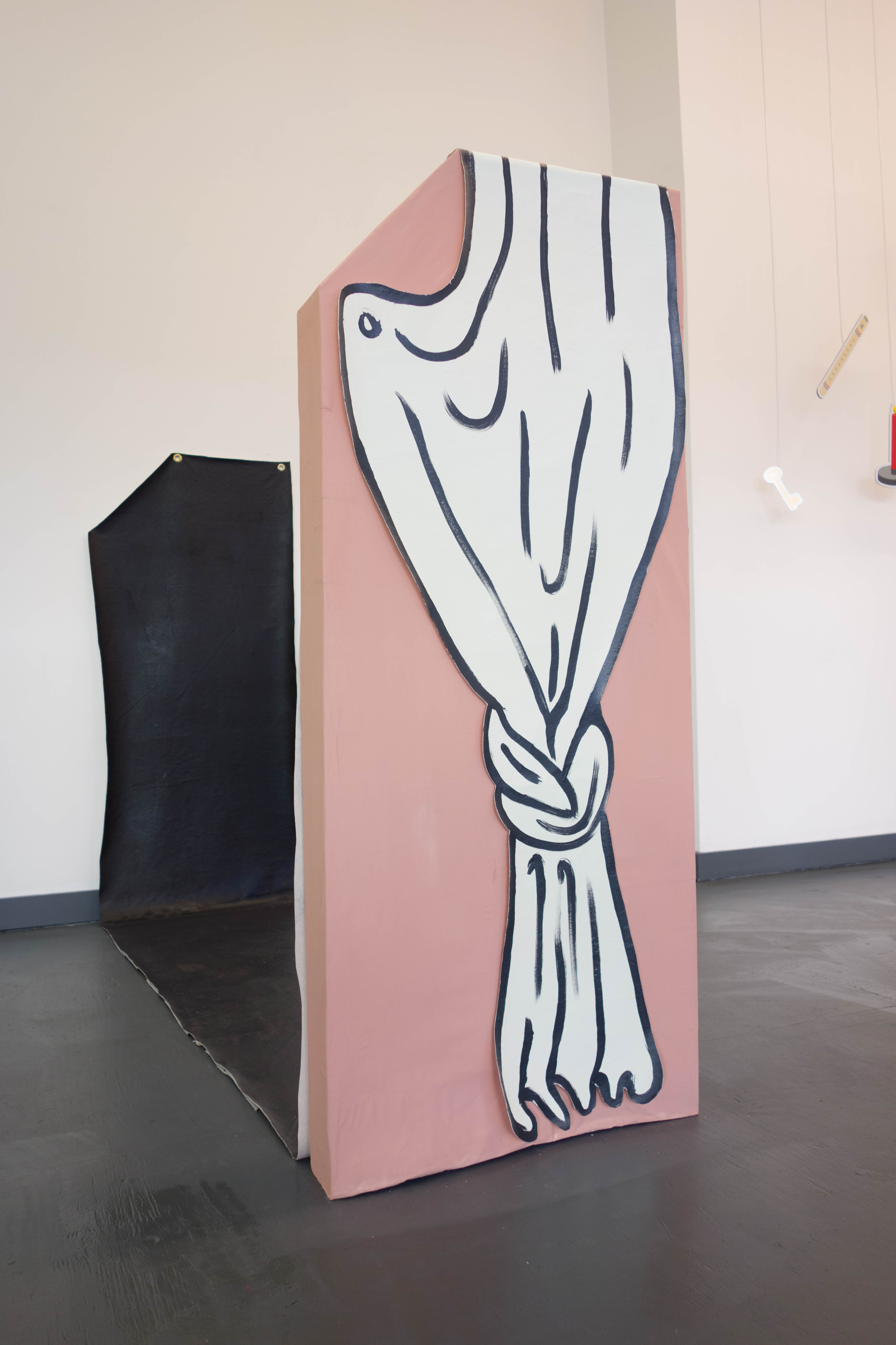
SS: Wait…so…I really like that. Labyrinth on a pillow. Rug on a rock. Curtain on the plinth. I really like thinking about your things-on-things. Objects within objects.
MM: The plinth was something different…I’ve done a lot with the curtain hanging off the wall… but that came out from the wall…still figuring that out…
SS: Yeah! I guess it literally came out from the wall. Cuz you have the shadow – but it’s almost like you pulled it out of the wall. That’s the path it followed. And if you look at it head-on…well, it’s parallel to the wall.
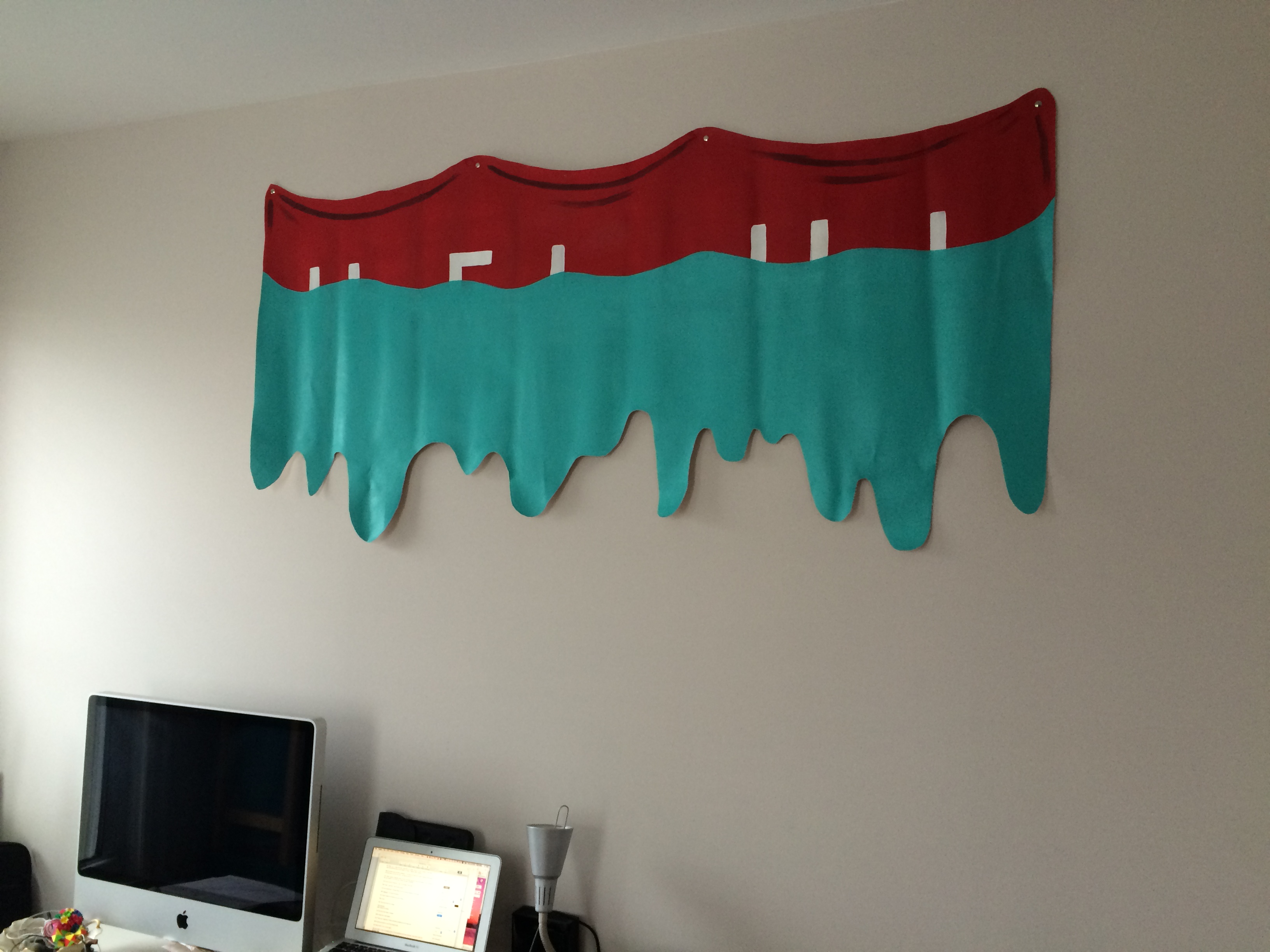
SS: By the way… see something?? [shows Maren her old painting hanging on the wall]
Fig. 7: “Wet Banner” by Maren Miller, 2011.
MM: OOoooh! I do!
SS: Taylor helped me finally put up your thing!
MM: Cool!
SS: That one’s kind of a curtain.
Trompe-L’oeil
SS: Oh, and kind of unrelated, going back to something I mentioned in our email. Did you like the thing I told you about the gift shop that had the painted rugs on the floor?
MM: Yeah that sounds so nice.
SS: They were really tender, delicate green and white checkered with little roses…and then they wore down over the years as people walked on them. It made me realize they don’t need real rugs. They’d just get dirty. They need them for decoration— why not just paint ‘em on the floor.
This makes me think… is what we’re doing something like trompe-l’oeil? Does it relate to that? Or maybe… not like the trompe-l’oeil part of wanting to make it look so real that you’re tricked— because my objects don’t look real. But I want to make my objects so… I don’t know, so joyful that you don’t want the real thing.
For example, you put an urn on your shelf. The urn is a container, a vessel— made to hold liquid or something, but mostly your just want to have it on display. In this case, a picture of an urn would be just as good, or even better than the real thing. A picture would be less fragile.
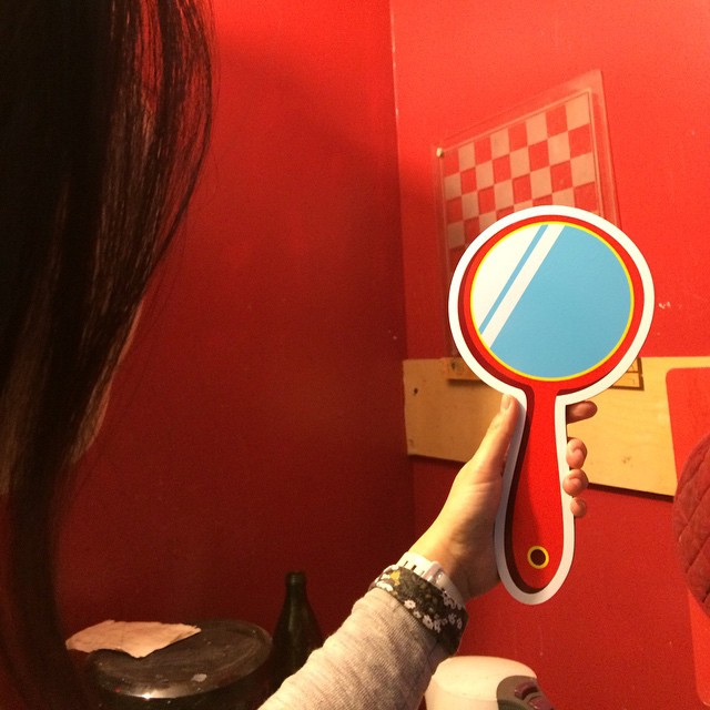
What I want… is to give the image-objects I make their own utility, or value. The mirror I made may never be able to be useful as a reflecting surface, but it still brings me… “joy” with its pleasing shape and pretty colors, and the feel I get when I hold it in my hand. So, to me, it’s already halfway there. A decorative hand mirror is definitely useful for its aesthetic qualities.
Fig. 8: Saki with her “mirror” item from Master & Lingo.
MM: Yeah it’s sort of like trying to experiment with making something into a symbol. I don’t know if that’s the right word.
SS: I guess i’m thinking about relation to objects. Like: what if we made all of our arrows so comfortable?
MM: [Laughing] The only thing that works in that same way for most people— automatically— are… ubiquitous symbols that are loaded with a ton of meaning. Like a cross.
People treat the image of a cross and an actual cross in a very similar way.
On the other end of the spectrum, people usually treat an arrow the same way, whether it’s cut out of something or drawn onto a piece of paper.
SS: It doesn’t matter if it’s 2D or 3D.
MM: It’s not dependent on its’ material. And that’s an interesting place.
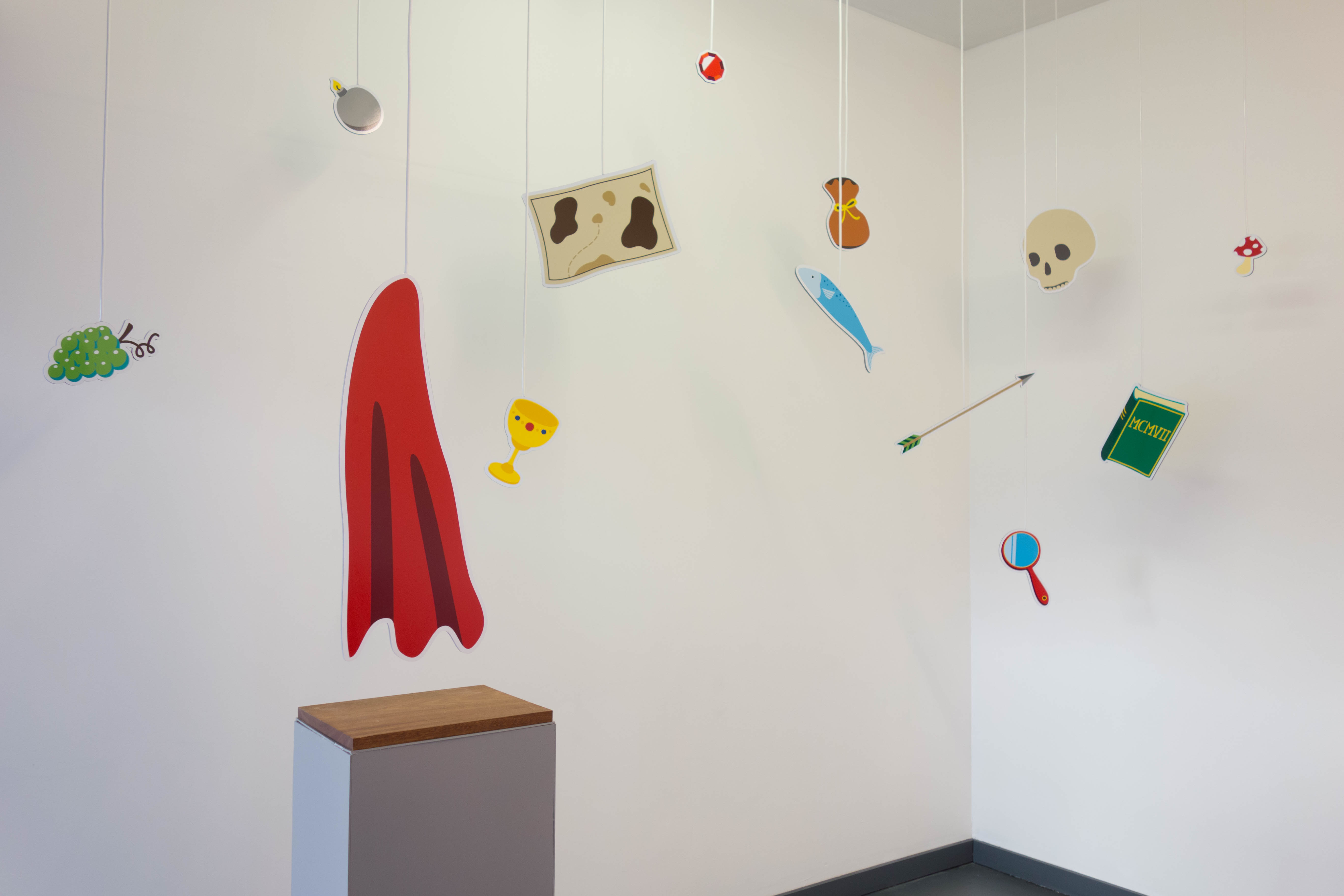
SS: I was thinking about… I guess you could call them super-universal or transcendental symbols [like arrows], and then I guess you have the ones that are more…generic or secular [like food staples]. And then the ones that are so heavy with meaning— like the cross— those are the ones I don’t think I can use in my work. At least not for this show.
Fig. 9: More “Items” by Saki Sato from Master & Lingo.
MM: [Referring to the email:] I love the thing you wrote about the banana.
SS: Yeah, I was thinking about that…I want to create an effect that…for example, if I present you with a banana, it is so universal, so generic, that you can’t really make a value judgement about it right away. Because when I show it to you there’s so little context that you can’t take it personally.
If I show you a picture of a banana you won’t be say, “Oh nooo… I hate bananas.”
You don’t feel like I’m asking you if you like bananas, or what you think about bananas. It kind of just represents fruit in general. Maybe an apple would do the same. But an apple has more historical baggage attached… Well so do bananas… but I don’t know that you could say one piece of its history defines its overall meaning. It’s still just a simple piece of food that babies, children and adults eat every day.
I mean, you can always put meaning on to something, but I like the objects that you’d be presented with and would have a neutral response. “Oh. Banana. Wonder what’s next?”
MM: Yeah.
SS: The opposite of that is showing someone a cross: “Oh, CROSS. I know this.”
You have an opinion about it. Feel the history.
But what if I took a banana and put it next to the cross? What would you think?
I like that because it’s taking something really neutral and something really heavy but nullifying the heavy meaning in a way because I have no idea what banana and cross ever had to do with each other. So it’s kind of liberating. It’s like I’m telling you there’s a story, but really there is no story. So you go to this dead end where you’re like, “Ok. I don’t get it.”
But it’s liberating for me to feel like I don’t get it.
Usually when I see a cross I say, “I know this. I get it,” and that kills any imaginative momentum.
MM: That’s super interesting about the moment of feeling liberated when you don’t get it.
There’s this thing that people often say to me: It looks like this is from a play. or it looks like a prop. or what world is this from?
And it always kind of bums me out when people say that because I don’t want people to look at my work and ask “What am I missing?” I want them to feel good in that moment of this thing being in your space.
SS: I know what you mean! I think props are an easy way to understand things as outside of our reality but belonging somewhere near our universe.
MM: We like working with things that are familiar and the kinds of emotions that that brings up. But I also feel that in a lot of ways we’re trying to isolate that feeling.
SS: And I wish the people who saw our work were like… “It’s ok that I don’t get it. It takes me to a new place where I can make up anything I want about it…”
But, yeah, I guess that’s the goal. I don’t know if it’ll get easier or harder… I’m sure people will always look for a specific predetermined meaning that’s easy to digest. It’s hard to describe trying to look for a way to take away something’s everyday meaning and make a new one. Cuz you’re in the space with the thing, but not in the way you’d normally be with it. Like being in the space with a curtain on a plinth… how do you relate to curtains there? And when you go home you hopefully relate to curtains in a new way.
Art That Touches You / Touching Public Sculpture
SS: Ok, so we talked about ideal objects in an ideal dimension before… but it made me think about how I really like that movie “Who Framed Roger Rabbit?” You know, cartoons in our reality, mixing the real with the artificial…
Did you have another thing you grew up with that really influenced you?
MM: Well, that scene in Beetlejuice where the sculptures came alive grab people always just blew my mind. I was obsessed with it.
SS: You just wanna touch people with you work, Maren.
MM: I want people to look at it and want to touch it so badly. But I don’t want to do it in a way that’s cheap. I don’t want just make it look all squishy… I want to make people want to touch something because of the shape that it’s in.
SS: Yeah, that’s so cool… I feel you. I think we both have that— the pleasure in sculpture is handling it. And we come up against this weird thing in the art world where you’re not supposed to touch things. and it’s hard to tell people to touch things without it being so overbearing.
MM: And you also don’t want to be TOLD to touch something! That’s super annoying.
SS: I dunno what the solution is. Maybe we just need to make a new environment where it’s OK to touch things.
MM: Well, I think that’s why we’re both so interested in public sculpture.
SS: You can climb on it and it’s indestructible!
MM: That context is established. Even if it has the sign not to touch… you know people are gonna touch it.
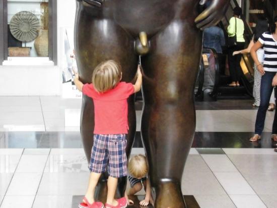
SS: Still gonna touch! Wipe that Botero penis until it shines.
Fig 10: Photo courtesy of Corvus2010 on TripAdvisor: “Klein und Gross – der Adam von Fernando Botero” (Jan 2014)
[MM laughs]
SS: So shiny.
MM: It’s just a wonderful thought.
SS: We want the art to be a more… physical, mental experience. You can get so much more out of it that way. We just need free reign. We need to make a Candy Land.
MM: The weather is less fun to deal with than people trying to touch your work.
[SS sneezes]
[MM makes a fart noise with her mouth]
SS: Ew! Don’t fart when I sneeze!
[MM makes fart noise again]
SS: That’s your response? When someone sneezes you rip a big one?
MM: Someone farted on me at the Getty today.
SS: Real close? Like, on your leg?
MM: No, SBD. It was a crowded corner of the bookstore and then suddenly I was alone with this horrible smell.
SS: They ran away?
MM: Went in there, did it, and then ran away.
SS: Taylor says it’s called crop dusting.
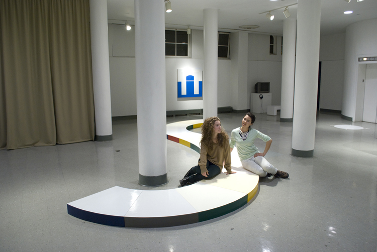
Fig. 11: Maren and Saki in contemplation at their thesis show, Time and Again, in 2010.
Saki Sato and Maren Miller are long-time friends and collaborators. For the showMaster & Lingo, Sato’s sculptures originate from the ceiling and Miller’s begin at the floor. Both occupy the abstract space where image is translated into object, and object into image.
They last showed work together in February 2010, and most recently curated a show of public sculpture in an abandoned lot in Brooklyn. Sato and Miller graduated The Cooper Union in 2010.
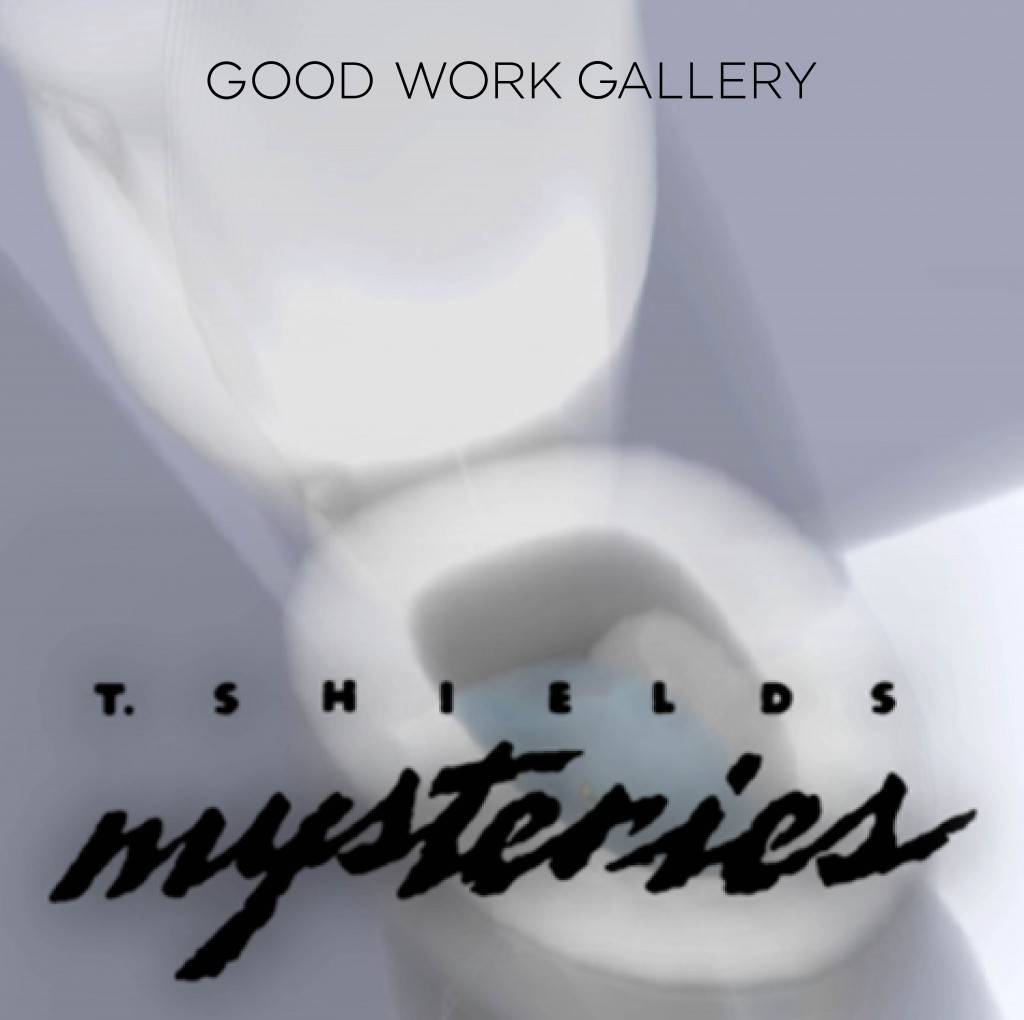
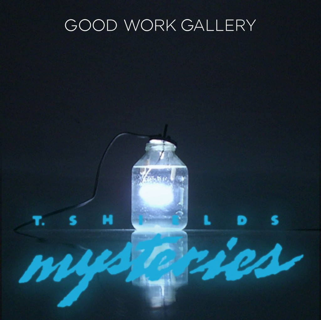
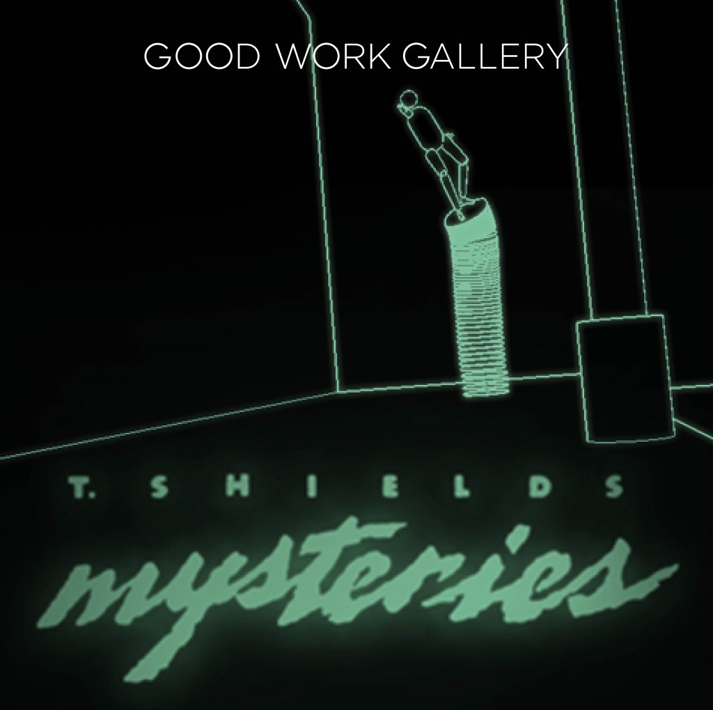
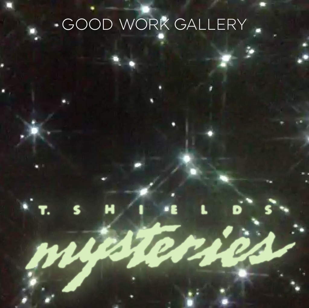
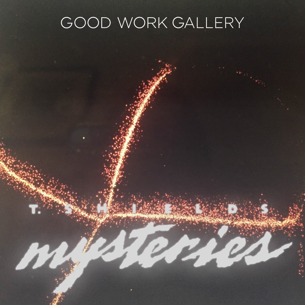
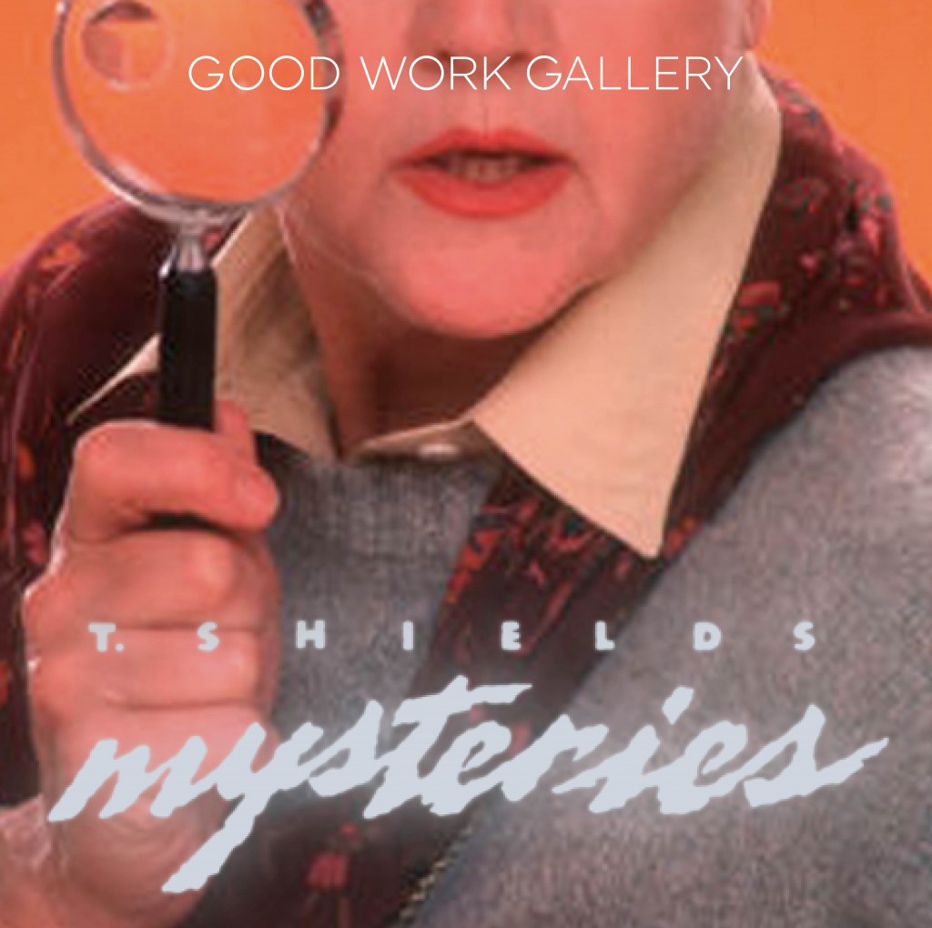
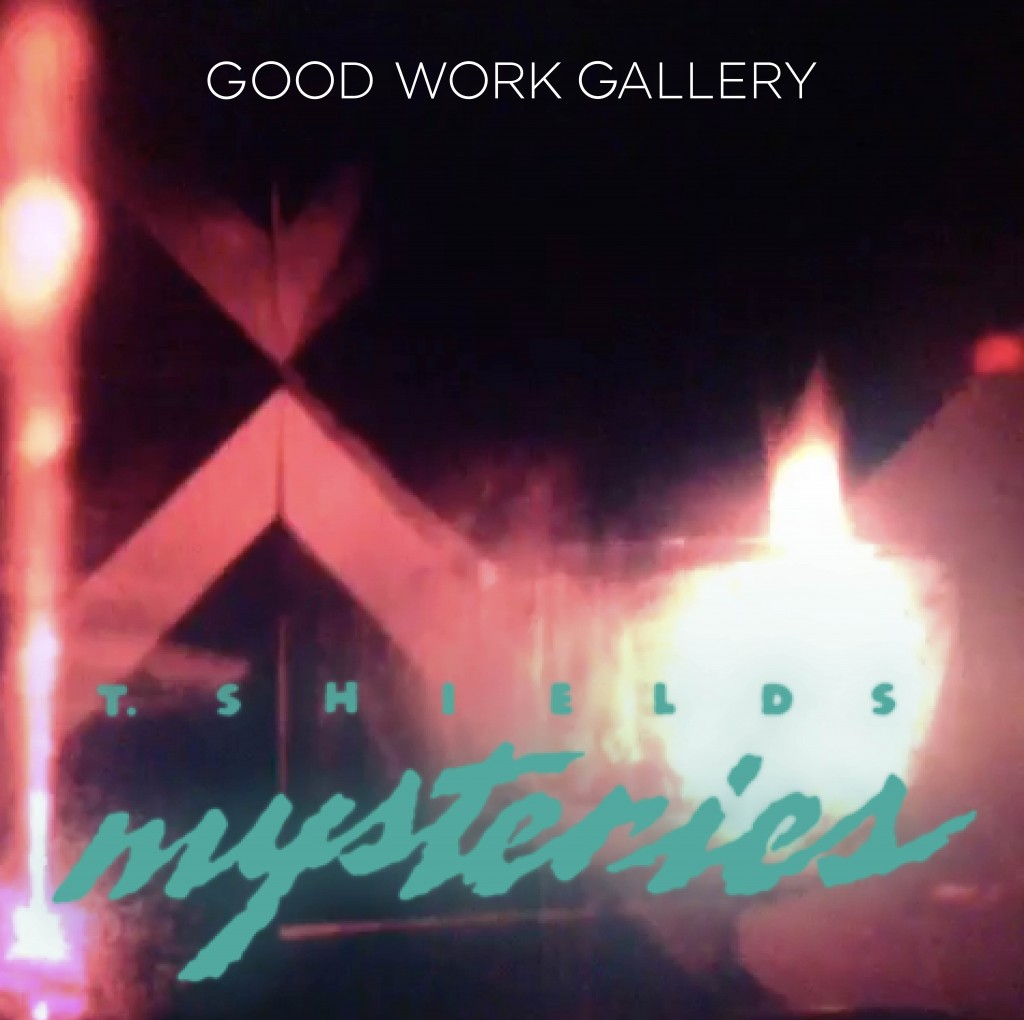
ONE NIGHT ONLY – Not quite a screening, not quite a lecture, Mysteries will present a survey of Shields’ short videos, excerpts, and performative demonstrations. This body of work investigates Shields’ interactions with physical and virtual spaces using simulations, animations and bodily actions. Don’t miss this one-time performance!
Taylor Shields received his BFA from Cooper Union (Sculpture and Video, ’09). Since then, he has continued screening videos, collaborated with DADDY, and was featured in Megazine’s last issue. He is also self taught in 3D modeling software and works as a miniature model fabricator. He lives and works in New York City. To preview some of Taylor Shields’ work, visit his website.
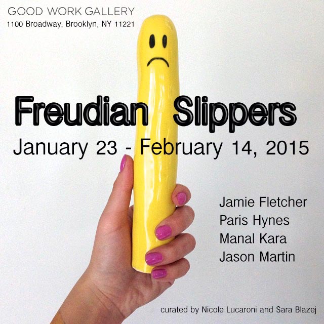
Jan 23 – Feb 14th
Opening reception:
Friday, Jan 23 from 6-9pm
After Party will follow at Lone Wolf Bar located conveniently near the gallery at 1089 Broadway.
Curated by Nicole Lucaroni and Sara Blazej
Featuring: Jamie Fletcher, Paris Hynes, Manal Kara, and Jason Martin
Good Work Gallery presents Freudian Slippers, an exhibition which depicts the con- stantly evolving significance of fetish aesthetics in art, and explores a subversion of power conventions interpreted through creative means.
The various aesthetics of fetish culture have deep art history lineage. Since nascent documentation over a century ago, imagery evoking submissiveness, the Gay un- derground, and play with power dynamics has proliferated itself into a mainstream consciousness through standard (and non-standard) media representation. Major social transformation and sexual revolution have allowed for altered and heightened percep- tions of desire to reshape and broaden the cultural landscape of fetishism today. In this exhibition, the subversive and taboo topic is skewed with humor, play, and practicality through form. With a tongue-in-cheek attitude, these artists attempt to bring the viewer closer to understanding and challenging their own perspectives on sexuality and fetish.
Jamie Fletcher
The “leather daddy” and “gimp” are two of the most recognizable fetishes we see. They have been around for years in gay eroti- cism, and have a long history in sadomasochistic fantasy. We continually see versions of this aesthetic in many current forms of media, such as films, advertisements, television, and routinely gracing fashion runways. In Fletcher’s work, however, we see a more painterly vision of this fetish, and with a woman’s perspective. Chains, masks, leather, and male-on male-submission are idealized – something not traditionally idealized in a hetero-normative world – and used to subtly express her struggles with her own femininity. Fletcher currently works and resides in NYC.
Paris Hynes
Paris Hynes’ series of oil paintings depicts figures in fetish attire – typically the iconic bondage suit, or gimp suit. Combining
the visual extreme of latex-covered bodies with the humorously banal way in which they are presented – standing alongside a tall potted houseplant, or confronting the viewer as a masked bust – Hynes pokes fun at both traditional portraiture as well as the perception of fetishists as deviant Others. He sources the images for these works from the Internet by culling photographs from deep fetish forums and blogs. He also uses commercial photos of products on bondage gear websites. Hynes’ carefully seductive rendering of the latex surfaces reveal a fixation on the textural qualities of the costumes, and suggest a conscious lean toward a more aesthetic appreciation of the BDSM experience. He lives and works in Brooklyn, NY.
Manell Kara
Her work takes traditional forms of houseware and décor, such as vases, cups and mugs, and undermines the original homemaker intention with the humorous use of breasts and penises. Conversely, her S&M product line, White Worm, flips the “evil sex dun- geon” look of most S&M toys and tools with its lighthearted flair of electric colors and playful new shapes. Kara is a Chicago- based artist and Dominatrix, and her works can also be found in local Brooklyn-based boutiques and showrooms.
Jason Martin
Jason Martin is an artist and musician who has been producing television, video, photography and other forms of media since the early ‘80s. His most recent performances and videos are part of an ongoing project named Animal Power Systems, a species and gender-queer exploration channeled through hybrid beings from otherworldly origin. The first appearance of his wolf character was used in the LP cover art for his band Brown Cuts Neighbors and the public broadcast TV show by the same name. His draw- ings elicit a mix of power dynamics veiled in the use of fetish roleplaying games and cartoon imagery. Martin is currently based in upstate New York and performs in NYC at many of its alternative venues.
Opening hours: Every Saturday & Sunday, Jan 24 – Feb 14, 2014. 12 PM – 6 PM.